Mostrando entradas con la etiqueta Estadística. Mostrar todas las entradas

lunes, 17 de marzo de 2014

The 17 Equations That Changed The Course Of History

Mathematics is all around us, and it has shaped our understanding of the world in countless ways.

In 2013, mathematician and science author Ian Stewart published a book on 17 Equations That Changed The World. We recently came across this convenient table on Dr. Paul Coxon’s twitter account by mathematics tutor and blogger Larry Phillips that summarizes the equations. (Our explanation of each is below):
 Stewart 17 equations table
Here is a little bit more about these wonderful equations that have shaped mathematics and human history:
Pythagorean theorem chalkboard
1) The Pythagorean Theorem: This theorem is foundational to our understanding of geometry. It describes the relationship between the sides of a right triangle on a flat plane: square the lengths of the short sides, a and b, add those together, and you get the square of the length of the long side, c.
This relationship, in some ways, actually distinguishes our normal, flat, Euclidean geometry from curved, non-Euclidean geometry. For example, a right triangle drawn on the surface of a sphere need not follow the Pythagorean theorem.

2) Logarithms: Logarithms are the inverses, or opposites, of exponential functions. A logarithm for a particular base tells you what power you need to raise that base to to get a number. For example, the base 10 logarithm of 1 is log(1) = 0, since 1 = 100; log(10) = 1, since 10 = 101; and log(100) = 2, since 100 = 102.
The equation in the graphic, log(ab) = log(a) + log(b), shows one of the most useful applications of logarithms: they turn multiplication into addition.
Until the development of the digital computer, this was the most common way to quickly multiply together large numbers, greatly speeding up calculations in physics, astronomy, and engineering.

3) Calculus: The formula given here is the definition of the derivative in calculus. The derivative measures the rate at which a quantity is changing. For example, we can think of velocity, or speed, as being the derivative of position — if you are walking at 3 miles per hour, then every hour, you have changed your position by 3 miles.
Naturally, much of science is interested in understanding how things change, and the derivative and the integral — the other foundation of calculus — sit at the heart of how mathematicians and scientists understand change.

 Isaac Newton
Isaac Newton
4) Law of Gravity: Newton’s law of gravitation describes the force of gravity between two objects, F, in terms of a universal constant, G, the masses of the two objects, m1 and m2, and the distance between the objects, r. Newton’s law is a remarkable piece of scientific history — it explains, almost perfectly, why the planets move in the way they do. Also remarkable is its universal nature — this is not just how gravity works on Earth, or in our solar system, but anywhere in the universe.
Newton’s gravity held up very well for two hundred years, and it was not until Einstein’s theory of general relativity that it would be replaced.

5) The square root of -1: Mathematicians have always been expanding the idea of what numbers actually are, going from natural numbers, to negative numbers, to fractions, to the real numbers. The square root of -1, usually written i, completes this process, giving rise to the complex numbers.
Mathematically, the complex numbers are supremely elegant. Algebra works perfectly the way we want it to — any equation has a complex number solution, a situation that is not true for the real numbers : x2 + 4 = 0 has no real number solution, but it does have a complex solution: the square root of -2. Calculus can be extended to the complex numbers, and by doing so, we find some amazing symmetries and properties of these numbers. Those properties make the complex numbers essential in electronics and signal processing.

 CubeA cube.
6) Euler’s Polyhedra Formula: Polyhedra are the three-dimensional versions of polygons, like the cube to the right. The corners of a polyhedron are called its vertices, the lines connecting the vertices are its edges, and the polygons covering it are its faces.
A cube has 8 vertices, 12 edges, and 6 faces. If I add the vertices and faces together, and subtract the edges, I get 8 + 6 – 12 = 2.

Euler’s formula states that, as long as your polyhedron is somewhat well behaved, if you add the vertices and faces together, and subtract the edges, you will always get 2. This will be true whether your polyhedron has 4, 8, 12, 20, or any number of faces.
Euler’s observation was one of the first examples of what is now called a topological invariant — some number or property shared by a class of shapes that are similar to each other. The entire class of “well-behaved” polyhedra will have V + F – E = 2. This observation, along with with Euler’s solution to the Bridges of Konigsburg problem, paved the way to the development of topology, a branch of maths essential to modern physics.
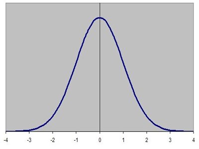
 Bell curve
The normal distribution.
7) Normal distribution: The normal probability distribution, which has the familiar bell curve graph to the left, is ubiquitous in statistics.
The normal curve is used in physics, biology, and the social sciences to model various properties. One of the reasons the normal curve shows up so often is that it describes the behaviour of large groups of independent processes.

8) Wave Equation: This is a differential equation, or an equation that describes how a property is changing through time in terms of that property’s derivative, as above. The wave equation describes the behaviour of waves — a vibrating guitar string, ripples in a pond after a stone is thrown, or light coming out of an incandescent bulb. The wave equation was an early differential equation, and the techniques developed to solve the equation opened the door to understanding other differential equations as well.

9) Fourier Transform: The Fourier transform is essential to understanding more complex wave structures, like human speech. Given a complicated, messy wave function like a recording of a person talking, the Fourier transform allows us to break the messy function into a combination of a number of simple waves, greatly simplifying analysis.

The Fourier transform is at the heart of modern signal processing and analysis, and data compression.

10) Navier-Stokes Equations: Like the wave equation, this is a differential equation. The Navier-Stokes equations describes the behaviour of flowing fluids — water moving through a pipe, air flow over an aeroplane wing, or smoke rising from a cigarette. While we have approximate solutions of the Navier-Stokes equations that allow computers to simulate fluid motion fairly well, it is still an open question (with a million dollar prize) whether it is possible to construct mathematically exact solutions to the equations.

11) Maxwell’s Equations: This set of four differential equations describes the behaviour of and relationship between electricity (E) and magnetism (H).

Maxwell’s equations are to classical electromagnetism as Newton’s laws of motion and law of universal gravitation are to classical mechanics — they are the foundation of our explanation of how electromagnetism works on a day to day scale. As we will see, however, modern physics relies on a quantum mechanical explanation of electromagnetism, and it is now clear that these elegant equations are just an approximation that works well on human scales.

12) Second Law of Thermodynamics: This states that, in a closed system, entropy (S) is always steady or increasing. Thermodynamic entropy is, roughly speaking, a measure of how disordered a system is. A system that starts out in an ordered, uneven state — say, a hot region next to a cold region — will always tend to even out, with heat flowing from the hot area to the cold area until evenly distributed.

The second law of thermodynamics is one of the few cases in physics where time matters in this way. Most physical processes are reversible — we can run the equations backwards without messing things up. The second law, however, only runs in this direction. If we put an ice cube in a cup of hot coffee, we always see the ice cube melt, and never see the coffee freeze.

 AP050124019477
Albert Einstein

13) Relativity: Einstein radically altered the course of physics with his theories of special and general relativity. The classic equation E = mc2 states that matter and energy are equivalent to each other. Special relativity brought in ideas like the speed of light being a universal speed limit and the passage of time being different for people moving at different speeds.
General relativity describes gravity as a curving and folding of space and time themselves, and was the first major change to our understanding of gravity since Newton’s law. General relativity is essential to our understanding of the origins, structure, and ultimate fate of the universe.

14) Schrodinger’s Equation: This is the main equation in quantum mechanics. As general relativity explains our universe at its largest scales, this equation governs the behaviour of atoms and subatomic particles.
Modern quantum mechanics and general relativity are the two most successful scientific theories in history — all of the experimental observations we have made to date are entirely consistent with their predictions. Quantum mechanics is also necessary for most modern technology — nuclear power, semiconductor-based computers, and lasers are all built around quantum phenomena.

15) Information Theory: The equation given here is for Shannon information entropy. As with the thermodynamic entropy given above, this is a measure of disorder. In this case, it measures the information content of a message — a book, a JPEG picture sent on the internet, or anything that can be represented symbolically. The Shannon entropy of a message represents a lower bound on how much that message can be compressed without losing some of its content.
Shannon’s entropy measure launched the mathematical study of information, and his results are central to how we communicate over networks today.

16) Chaos Theory: This equation is May’s logistic map. It describes a process evolving through time — xt+1, the level of some quantity x in the next time period — is given by the formula on the right, and it depends on xt, the level of x right now. k is a chosen constant. For certain values of k, the map shows chaotic behaviour: if we start at some particular initial value of x, the process will evolve one way, but if we start at another initial value, even one very very close to the first value, the process will evolve a completely different way.

We see chaotic behaviour — behaviour sensitive to initial conditions — like this in many areas. Weather is a classic example — a small change in atmospheric conditions on one day can lead to completely different weather systems a few days later, most commonly captured in the idea of a butterfly flapping its wings on one continent causing a hurricane on another continent.

17) Black-Scholes Equation: Another differential equation, Black-Scholes describes how finance experts and traders find prices for derivatives. Derivatives — financial products based on some underlying asset, like a stock — are a major part of the modern financial system.
The Black-Scholes equation allows financial professionals to calculate the value of these financial products, based on the properties of the derivative and the underlying asset.
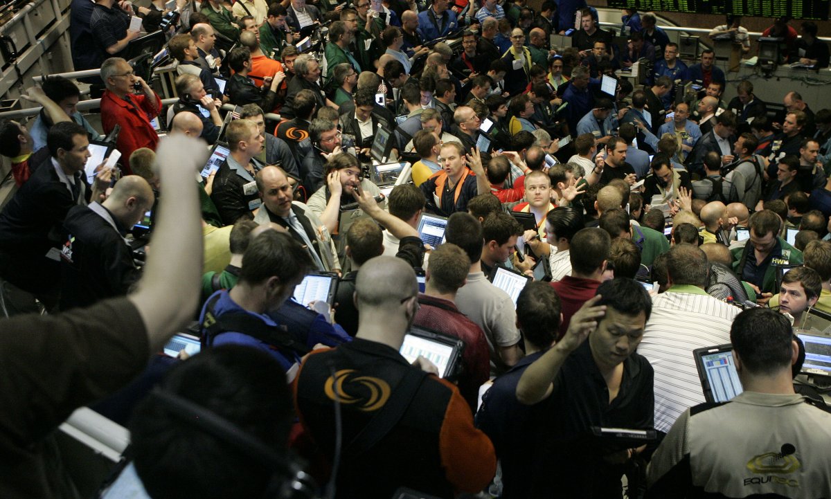
 Cboe stock options traderHere are some traders in the S&P 500 options pit at the Chicago Board Options Exchange. You won’t find a single person here that hasn’t heard about the Black-Scholes equation.


ORIGINAL: Business Insider
Andy Kiersz
Mar 13 2014

lunes, 29 de abril de 2013

MIT's 2013 Top 10 Breakthrough Technologies - 3: Big Data from Cheap Phones

ORIGINAL: Tech Review
By David Talbot
April 23, 2013

Collecting and analyzing information from simple cell phones can provide surprising insights into how people move about and behave—and even help us understand the spread of diseases.


WHY IT MATTERS
Poor countries lack data-gathering infrastructure; phone data can provide it.

Breakthrough
Creating disease–fighting tools with cell-phone mobility data.

Key Players
• Caroline Buckee, Harvard University
• William Hoffman, World Economic Forum
• Alex Pentland, MIT
• Andy Tatem, University of Southampton

At a computer in her office at the Harvard School of Public Health in Boston, epidemiologist Caroline Buckee points to a dot on a map of Kenya’s western highlands, representing one of the nation’s thousands of cell-phone towers. In the fight against malaria, Buckee explains, the data transmitted from this tower near the town of Kericho has been epidemiological gold.

When she and her colleagues studied the data, she found that people making calls or sending text messages originating at the Kericho tower were making 16 times more trips away from the area than the regional average. What’s more, they were three times more likely to visit a region northeast of Lake Victoria that records from the health ministry identified as a malaria hot spot. The tower’s signal radius thus covered a significant waypoint for transmission of malaria, which can jump from human to human via mosquitoes. Satellite images revealed the likely culprit: a busy tea plantation that was probably full of migrant workers. The implication was clear, Buckee says. “There will be a ton of infected [people] there.”

Caroline Buckee
This work is now feeding into a new set of predictive models she is building. They show, for example, that even though malaria cases were seen at the tea plantation, taking steps to control malaria there would have less effect on the disease’s spread than concentrating those efforts at the source: Lake Victoria. That region has long been understood as a major center of malaria, but what hasn’t been available before is detailed information about the patterns of human travel there: how many people are coming and going, when they’re arriving and departing, which specific places they’re coming to, and which of those destinations attract the most people traveling on to new places.

Caroline Buckee, a Harvard epidemiologist, is using detailed data on population movements—gleaned from mobile phones— to build precise new tools for fighting the spread of malaria.

Existing efforts to gather that kind of travel data are spotty at best; sometimes public-health workers literally count people at transportation hubs, Buckee says, or nurses in far-flung clinics ask newly diagnosed malaria victims where they’ve been recently. “At many border crossings in Africa, they keep little slips of paper—but the slips get lost, and nobody keeps track,” she says. “We have abstractions and general models on travel patterns but haven’t been able to do this properly—ever.”

The data mining will help inform the design of new measures that are likely to include cheap, targeted campaigns of text messages—for example, warning visitors entering the Kericho tower’s signal zone to use bed netting. And it will help officials choose where to focus mosquito control efforts in the malarial areas. “You don’t want to be spraying every puddle for mosquito larvae all the time. But if you know there is a ton of importation from a certain spot, you want to increase your control program at that spot,” Buckee says. “And now I can pinpoint where the importation of a disease is especially important.”

Buckee’s most recent study, published last year in Science and based on records from 15 million Kenyan phones, is a result of a collaboration with her husband, Nathan Eagle, who has been working to make sense of cell-phone data for more than a decade. In the mid-2000s, after getting attention for his work mining data from the phones of volunteers at MIT, Eagle started to get calls from mobile carriers asking for insight into questions like why customers canceled their phone plans. Eagle began working with them. And when the couple spent 18 months in Africa starting in 2006—Buckee was doing work on the genetics of the malaria parasite—he studied call data for various purposes, trying to understand phenomena like ethnic divisions in Nairobi slums and the spread of cholera in Rwanda. Buckee’s results show what might be possible when the technology is turned on public-­health problems. “This demonstrated ‘Yeah, we can really provide not just insight, but actually something that is actionable,’” says Eagle, now CEO of Jana, which runs mobile-phone surveys in the developing world. “This really does work.”

“This is the future of epidemiology. If we are to eradicate malaria, this is how we will do it.”

That demonstration suggests how such data might be harnessed to build tools that health-care workers, governments, and others can use to detect and monitor epidemics, manage disasters, and optimize transportation systems. Already, similar efforts are being directed toward goals as varied as understanding commuting patterns around Paris and managing festival crowds in Belgium. But mining phone records could be particularly useful in poor regions, where there’s often little or no other data-­gathering infrastructure. “We are just at the start of using this data for these purposes,” says ­Vincent Blondel, a professor of applied mathematics at the University of Louvain in Belgium and a leading researcher on data gleaned from cell phones. “The exponential adoption of mobile phones in low-income settings—and the new willingness of some carriers to release data—will lead to new technological tools that could change everything.”

Blank Slate
The world’s six billion mobile phones generate huge amounts of data—including location tracking and information on commercial activity, search history, and links in social networks. Innumerable efforts to mine the data in different ways are under way in research and business organizations around the world. And of those six billion phones, five billion are in developing countries. Many of them are cheap phones that can do little besides make calls and send text messages. But all such activity can be tracked back to cell-phone towers, providing a rough way to trace a person’s movements. Throw in the spread of mobile payment technology for simple commerce and you have the raw material for insights not only into epidemiology but into employment trends, social tensions, poverty, transportation, and economic activity.

This map, a product of cell-phone data analytics, shows the most important sources of malaria infections (darker shades)—taking into account the potential for further transmission caused by human travel—as well as the major destinations of people exposed to the disease (lighter shades). It can be used to determine where best to focus warnings and mosquito control techniques.


jueves, 8 de noviembre de 2012

Why Math is Like the Honey Badger: Nate Silver Ascendant

November 7, 2012


Add caption
“Neglect of mathematics works injury to all knowledge, since one who is ignorant of it cannot know the other sciences, or the things of this world. And what is worst, those who are thus ignorant are unable to perceive their own ignorance, and so do not seek a remedy.” — Roger Bacon

It’s no secret that lots of people hate and fear any kind of math. I certainly spent much of my life fighting a knee jerk inward cringe at the mere sight of an equation, and many of the folks I spoke with while writing The Calculus Diaries had even more extreme reactions. They talked about sweaty palms, cold sweats, and a cold knot of dread in the pit of their stomachs when encountering anything to do with numbers. Per my friend Lee, who initially failed her high school algebra class: “It wrecked my self-confidence in a way nothing else ever did, and still knots my stomach. I’m not totally innumerate, but anything that looks like an equation makes me break out into a cold sweat and run screaming in the other direction.”

Another friend, Allyson, was even more blunt: “My initial reaction to the word ‘calculus’ is not unlike a caveman throwing rocks at the moon in ignorance and fear resulting in blind rage. There is no such thing as ghosts creeping up behind me on the stairs, but there is such a thing as a polynomial monster, and it has hooked teeth and causes chronic yeast infections, I’m sure.”

I can’t speak to the yeast infections, but a new psychological study indicates that such reactions do have real, measurable physical effects. Specifically, when it comes to neural responses, math anxiety reads much the same as physical pain. It’s not the numbers themselves, but the anticipation of encountering them, that seemed to trigger anxious, painful responses in the test subjects.

There are many complicated reasons why people react this way, but one of them might be the fact that math is just so damned unyielding, the enemy of wishful thinking, dashing our most cherished hopes with its cold hard facts. And is it sorry? It is not! Like the infamous honey badger, math don’t care. Math don’t give a s$%.

Also like the honey badger, math has shown itself to be quite the badass of late. If ever there was an iron-clad case to be made for math literacy, it’s what happened over the last few weeks with the New York Times‘ star statistician Nate Silver and his 538 blog (named after the 538 votes in the electoral college).

For the 0.1% of you who don’t know Silver’s name by now, he started out analyzing the statistical probabilities of baseball teams, then turned his attention to the 2008 presidential elections. He devised a fairly sophisticated mathematical model that didn’t just rely on a few public opinion polls here and there, but fed all the polls into the model, with additional tweaking to eliminate the inevitable sampling errors. And the results were pretty darned impressive: he correctly called 49 out of the 50 states and many of the Congressional races that year as well.

Fast forward to the 2012 presidential election, when most pundits were describing the race as a veritable toss-up between Mitt Romney and Barack Obama. As partisan tensions rose, Silver’s forecast became a handy target, because his models consistently gave Obama much better statistical odds than the general punditry at winning re-election. Even at the low point of the Obama campaign, in the aftermath of that first debate, Silver’s model still gave the president around a 66% chance of re-election — largely based on his rigorous analysis of polling trends in critical battleground swing states. A week before Election Day, those odds increased to around 75%, rising steadily to a final prediction of 90.9%.

This was in stark contrast to the conservative punditry, who seemed to be inhabiting a bizarre alternate reality where Romney held a slight lead and was poised to win many of the battleground states. George Will, Peggy Noonan, Newt Gingrich, Fox News’ numbers guy Michael Barone, and GOP strategist Karl Rove all predicted a solid Romney win, breaking 300 electoral votes and winning the popular vote, while Dick Morris hopped on the crazy train and predicted a Romney landslide. (Hey,someone‘s gotta take the longshot odds!)

How to explain the discrepancy? The conservatives went on the offense, attacking Silver’s analysis as hopelessly biased — everyone knew, they said, that Silver was “in the tank” for Obama — and overly reliant on polls skewed in favor of Obama. This last accusation even inspired a separate Website, Unskewed Polls, purporting to be an unbiased analysis — shades of Fox News’ laughable “fair and balanced” tagline. (Huh. Conservatives didn’t have a problem with Silver’s 2010 prediction of major gains for the GOP in the House, which also proved to be highly accurate.)

The attacks got pretty personal, with David Brooks calling Silver “over-rated,” MSNBC’s Joe Scarborough dismissing him as an ideologue and “a joke,” and even Politico’s Dylan Byers pondering whether Silver was “a one-term celebrity” — as if it was his name recognition, rather than the numbers, that mattered. And the Unskewed Polls founder, Dean Chalmers, sneered in The Examiner that Silver was “a man of very small stature, a thin and effeminate man with a soft-sounding voice that sounds almost exactly like the ‘Mr. New Castrati’ voice used by Rush Limbaugh on his program.”

Nate Silver
Honestly, what could a scrawny, liberal-intellectual girly-man with a reedy voice really tell us about such a close election, relying on something as magically intangible as numerical wizardry? Silver channeled his inner honey badger and handled the backlash admirably, ably defending his statistical methodology against the charges of wizardry and partisan bias, and cheekily responding to his detractors on Twitter.

(My favorite Silver tweet, after the massive storm, Sandy, devastated New York and New Jersey: “”CAN’T BELIEVE METEOROLOGISTS USED MATH AND SCIENCE TO PREDICT THIS STORM. THEY MUST BE MAGIC WIZARDS.”

He kept chugging away at his predictive model, feeding in the daily poll numbers and crunching the data, accounting for confounding factors and potential sources of bias, trusting in teh math over the gut instincts of the punditry. As many others have pointed out, there was a great deal of ignorance of statistical probabilities — and thenature of uncertainty — behind much of the Silver criticism (not that there aren’t valid things to criticize in his model, but bitching about his reedy voice and slight built aren’t among them).

Clearly, that widespread antipathy towards all things numerical plagues some otherwise very smart people. But the outcry was as much part of the rampant anti-intellectualism that dominates certain circles in our society. In a post at Deadspin, David Roher opined, “It was only a matter of time before the war on expertise spilled over into the cells of Nate Silver’s spreadsheets.” Stephen Colbert memorably said reality has a well-known liberal bias; apparently that bias extends to math.

(For those keen on knowing more details, Zeynep Tufekci of the University of North Carolina offered one of the best defenses of Silver and statistical modeling methods at Wired: check it out.)

Silver is not an oracle, and has never claimed to be, so the over-reaction was just plain silly. Sure, by late October 538's models favored Obama 79% to 21%, when the national polling averages were indicating a dead heat. But any good poker player will tell you that a 21% favored hand wins quite frequently — i.e., 21% of the time. In fact, Silver himself used the poker metaphor in his last post before Election Day, estimating Romney’s chances of winning the election as being roughly the same odds as drawing in inside straight:

[I]n poker, making an inside straight requires you to catch one of 4 cards out of 48 remaining in the deck, the chances of which are about 8 percent. Those are now about Mr. Romney’s chances of winning the Electoral College, according to the FiveThirtyEight forecast.

As any poker player knows, those 8 percent chances do come up once in a while. If it happens this year, then a lot of polling firms will have to re-examine their assumptions — and we will have to re-examine ours about how trustworthy the polls are. But the odds are that Mr. Obama will win another term.

He later slightly revised those odds to give Romney a 9.1% chance of an upset — largely to account for just the sort of pro-Obama potential bias in the polls that his critics had been braying about. So how’d Silver do in predicting the actual election? Check it out:


Boo-yah! Behold the data, for it is mighty! Silver correctly predicted 50 states out of 50, and even nailed the popular vote within a few tenths of a percentage point. When the graphic above hit Twitter, Alaska’s returns hadn’t been recorded, but it went, as predicted, to Romney. The sole genuine toss-up state, Florida — which Silver had at 50/50 odds — is still technically not final (as of 5 PM EST on Wednesday, November 7), waiting on votes from Miami-Dade county, which heavily favors Obama, who already holds a slight lead. It’s expected Florida will also land in Obama’s column, so Silver’s controversial last-minute switch of Florida from light pink to light baby blue was justified. (To see how all the others fared, check out this graph.)

Plus his book sales are skyrocketing, he’s well poised to negotiate an even more lucrative contract with the Times, and he’s inspired his own Chuck Norris style Twitter hastag, #NateSilverfacts. (My favorite so far: “When criticized by pundits, Nate Silver doesn’t get angry – he regresses toward the mean.”) Oh, and one satirical Website proclaimed Silver a witch. One imagines an elated Silver dancing Gangnam style in his office digs, thoroughly vindicated by the election returns — although it’s more likely that he collapsed in exhaustion, given his feverish frequency of updates over the last few weeks. But he’s certainly earned to the right in indulge in a bit of Schadenfreude.

That was just the presidential race, of course. I haven’t seen a full assessment of his predictions for other races, but there was at least one major upset in North Dakota, when Heidi Heitberg narrowly edged out opponent Rick Berg, despite Silver giving the latter a 92.5% chance of re-election.

And he missed on a Montana race, too, where the Democratic candidate handily won, although Silver gave his Republican opponent a 66% chance of winning (although there were far fewer Montana polls, and hence not as large of a data sample). So, yanno, the guy’s not perfect. That’s statistical uncertainty for you.

Still, to quote a classic xkcd comic: SCIENCE! It works, bitchez! The math doesn’t care what you want to be true: it calls it like it sees it, denialism be damned. The honey badger heartily approves.

xkcd's Randal Munroe nails it. As always.
Which is why it was so fascinating to watch the election coverage meltdown on Fox News as the numbers came rolling in: denialism crashed head-first into numbers-based reality and popped the conservative punditry bubble. The cognitive dissonance was palpable. (As Steve Mirsky noted on Twitter, “Fox News is having a psychotic break.)

Rove actually objected on-air when Fox’s independent election analysts called the race for Obama, insisting Romney still had a fighting chance in Ohio. Anchor Megyn Kelly marched down the hall to the analysts’ desk and demanded an explanation.

To their credit, the analysts (who had done the math) didn’t back down: “We’re actually quite comfortable with the call.” And of course, the analysts were right, something Rove — a smart, math-minded guy in his own right, when he’s not blinded by partisanship — grudgingly conceded in the end. (So did Barone, Gingrich, and Morris.)

So is Nate Silver the new God of the Geeks? Should we all bow down to our thin, effeminate Mathematical Wizardry Overlord? Not so fast. As several folks pointed out this morning, Silver certainly wasn’t the only poll-savvy statistician with heavy odds favoring an Obama re-election — most notably, Sam Wang’s Princeton Election Consortium gave Obama 98% odds of re-election. He was just the most visible.

Silver’s gift is combining rigorous statistical modeling with a savvy populist approach. But he did bear the brunt of the criticism, so it’s only fair he reap the requisite rewards. Ironically, Silver also predicted the post-election reaction to his analysis, in an interview with Buzzfeed: “I’m sure that I have a lot riding on the outcome. I’m also sure I’ll get too much credit if the prediction is right and too much blame if it is wrong.”

The real winner wasn’t Silver, but the math. The 2012 election was a real-time experiment in the accuracy of statistical modeling, and it passed with flying colors. That doesn’t mean there still isn’t room for improvement, or that such models are infallible, but the fundamental principles are solid. For now. Call it the triumph of the nerds. I doubt we’ve seen the end of denialism, by a long shot, but it’s nice when, once in awhile, scientific rigor gets a big win.


Add caption
About the Author: Jennifer Ouellette is a recovering English major turned science writer who loves to indulge her inner geek by finding quirky connections between physics, popular culture, and the world at large. Follow on Twitter @JenLucPiquant.

lunes, 20 de agosto de 2012

Statisticians Predict The Number Of Olympic Records That Will Fall at London 2012

ORIGINAL: Technology Review -  THE PHYSICS ARXIV BLOG

A statistical analysis of the factors that determine how long Olympic records last reveals how many are likely to fall in the next two weeks in London


Tuesday, July 31, 2012

With the 2012 Olympics in full swing in London, it's a good time for statisticians to reveal the power and glory of their discipline. For example, given the way Olympic records have fallen in the past, how many are likely to fall at these games? 

Today, Elliott Holli eld at the University of North Carolina at Asheville and a couple of pals publish a fascinating analysis of this question. In short, they make predictions for records in 51 events and say that between 20 and 31 of these will topple. 

More interesting and subtle is their analysis of the factors that determine how long records last. 

As with many statistical questions, this one is deceptively tricky. Hollield and co collected data on 63 events going back to 1896. In this time, a total of 693 records were broken. It's then straightforward to plot a time series for each record showing how long each one lasted. 

But why do some records last longer than others? To provide insight into this question, Hollield and pals looked at the influence of various factors on how long a record lasted using various different statistical approaches. 

In total, these guys studied 17 so-called covariates including age and gender, whether the record setter was from the host country, whether the setter was already an Olympic medalist, the growth rate of the GDP per capita of the setter's home country and so on. The results make for interesting reading. 

First, the factors that have little or no influence. Gender makes no difference; men's records do not tend to last longer than women's or vice versa. Neither does age. 

More surprisingly, the host country does not have a significant influence wither. It's easy to imagine that home support might spur athletes to greater heights making them more likely to break Olympic records. Not so, say Hollield and co. 

It's also easy to imagine that a country's wealth or a change in population size can make a difference but they don't. 

So what does make a difference? It turns out that if the current holder also set the record in the past, the record is more likely to be broken at the next games. 

If the current Olympic record is also the world record, it is less likely to be broken in the next games. 

A change in the number of countries competing in an event is also an important indicator of whether the record will fall. 

And most surprising of all, the percentage by which the existing record improved on the first Olympic record, is also a significant indicator 

That's interesting stuff. However, Hollield and co could have gone further. There are some 300 Olympic events but they don't bother to mention which 63 events they analysed. 

Neither do they have any fun with their results. They could, for example, have pointed to events where the Olympic record looks most vulnerable. But instead, they keep their heads firmly in their shells.

No doubt, these guys will argue that they are unable to make statistically significant predictions for specific events.

On the other hand, it is possible to publish results, even if they are statistically insignificant, and let the rest of us have some fun with them. There's no harm in clearly labelled speculation, right? 

Ref: arxiv.org/abs/1207.6133: A Survival Analysis of the Duration of Olympic Records


Contributor

The Physics arXiv Blog produces daily coverage of the best new ideas from an online forum called the Physics arXiv on which... 

lunes, 12 de septiembre de 2011

Clima y tiempo: Medidas extremas

ORIGINAL: Nature
Versión Español por Ciencia en Canoa


Será posible que los violentos huracanes, las inundaciones y las sequías tengan origen en el cambio climático? Los científicos están empezando a decir que sí.

Clima y tiempo: Medidas extremas


Cuando el clima se torna extraño, como sucede mucho en estos días, una pregunta surge inevitablemente de periodistas, políticos y el público en general: ¿es debido al calentamiento global?

La pregunta fue hecha después de las catastróficas inundaciones del año pasado en Pakistán y de la ola de calor extrema en Rusia. Se preguntó de nuevo este año sobre el monstruosa serie de tornados en el sureste de Estados Unidos y la devastadora sequía en África. Y se preguntó una vez más este mes de agosto cuando el huracán Irene rugió en la Costa Este de los EE.UU..

En su mayor parte, los investigadores del clima se han negado a responder. Su mantra es que la ciencia no puede atribuir cualquier particular la sequía o un huracán con el cambio climático, lo mejor que puede hacer es proyectar cómo la frecuencia de eventos climáticos extremos podrían cambiar a medida que se calienta el planeta, a través de cambios en factores tales como 

  • las tasas de evaporación en el océano abierto , 
  • el vapor de agua y la formación de nubes, y 
  • la circulación atmosférica.
Últimamente, sin embargo, que la resistencia ha comenzado a desvanecerse."Mi pensamiento ha evolucionado", dice Gavin Schmidt, modelador climático en el Instituto Goddard para Estudios Espaciales en Nueva York. Gracias a 
  • los avances en las herramientas estadísticas, 
  • los modelos climáticos y 
  • la potencia de los computadores, 
"la atribución de los extremos es difícil - pero no es imposible", dice. Dos estudios publicados en febrero pasado en la revista Nature mostraron los vínculos entre las condiciones meteorológicas extremas y el cambio climático - uno mirando las inundaciones catastróficas en el Reino Unido en 2000(1), y otro por el aumento a finales del siglo XX en las intensas lluvias en todo el Hemisferio del Norte(2)
.
También en el último año, los investigadores del clima en los Estados Unidos y Gran Bretaña han formado una coalición con 'ACE' (Attribution of Climate-related Events - Reconocimiento de eventos relacionados con el clima -) como sigla y han comenzado una serie de estudios coordinados diseñados para sentar las bases para un programa de efectos climáticos sistemáticos. Finalmente, el grupo espera crear un sistema internacional que podría evaluar la influencia del cambio climático en los fenómenos meteorológicos casi tan pronto como sucedan, o incluso antes de que lleguen, con los resultados anunciados en los reportes del tiempo todas las noches.

"La idea es buscar cada mes más o menos las posibilidades de cambio" asociadas con esa influencia, dice Peter Stott, un científico del clima con Centro Hadley de la Oficina Meteorológica del Reino Unido en Exeter y líder del grupo de la ACE. Stott está escribiendo un libro blanco para trazar planes y requisitos para un sistema de atribución casi en tiempo real, que presentará en octubre en la Conferencia Mundial sobre el Programa de Investigación Climática en Denver, Colorado.

Terribles consecuencias

Los fenómenos climáticos extremos son algunos de los desastres más destructivos conocidos, si su precio se mide en vidas - cerca de 40.000 personas murieron como consecuencia de la ola récord de calor de Europa en 2003 - o en dinero -  la Costa del Golfo de los EE.UU. sufrió más de $ 80 mil millones en daños y perjuicios en septiembre de 2005 por el huracán Katrina. Lo que es peor, que la cifra va en aumento: las cifras del  National Climatic Data Center (Centro nacional de datos climáticos) de los EE.UU. en Asheville, Carolina del Norte, muestran que la frecuencia de los desastres meteorológicos del orden de miles de millones de dólares se ha duplicado desde 1980.

Saber las causas de los desastres es una cuestión de interés fundamental para 
  • las compañías de seguros que han de fijar las tarifas, 
  • los ingenieros civiles que tienen que decidir cómo (o si es necesario) fortalecer las protecciones tales como diques, y para
  • las comunidades, regiones y naciones que luchan por adaptarse acambios a largo plazo en el clima. 
Si el aumento de la frecuencia es resultado sólo de los ciclos naturales, es probable que desaparezcan algún día pronto.Pero si el aumento es un resultado del calentamiento global, las pérdidas y los daños podrían seguir aumentando indefinidamente.

La atribución confiable de los eventos climáticos extremos también es importante para la comprensión del público sobre el cambio climático y su disposición a apoyar las medidas para reducir las emisiones de gases de efecto invernadero.A diferencia de los impactos más lejanos del calentamiento global, tales como el nivel del mar que sube lentamente, los efectos de los fenómenos meteorológicos extremos locales tienden a ser inmediatos y registrados de manera tangible vívidamente. Las encuestas sugieren que las personas que sienten que han experimentado personalmente los efectos del cambio climático son más propensos a creer que es un problema real - y que requiere la solución - que aquellos que no tienen.

Trazando un curso

Con los imperativos de la mente, el grupo ACE se ha dedicado a explorar la relación clima-tiempo de manera sistemática, por la alimentación de los datos de observación de la Oficina Meteorológica del Reino Unido y los EE.UU. El Centro Nacional de Investigación Atmosférica (NCAR) en Boulder, Colorado, de las predicciones estacionales y a largo plazo los modelos climáticos.

La atribución, sin embargo, no es una tarea simple: múltiples factores que influyen en un evento relacionado con el clima. El cambio climático global debe tener algún efecto: la física básica que sugiere un ambiente más cálido puede contener más vapor de agua, por ejemplo, y por lo tanto, deben desarrollar más tormentas, que se alimentan de la humedad y el calor. Pero los ciclos naturales como El Niño tendrá un efecto igualmente obvio: el clima caprichoso era un problema para los humanos mucho antes de que comenzara a bombear cantidades industriales de dióxido de carbono a la atmósfera.
Desplazamiento Climático. Nature
Así que el objetivo del grupo ACE es llevar a cabo "la atribución de fracciones de los fenómenos extremos, la estimación de la cantidad de cada uno de ellos fue influenciado por el efecto invernadero antropogénico y cuánto por los ciclos naturales (véase el "cambio climático"). Los estudios  aparecidos en la revista Nature de Febrero (2011) (1), (2) ofrecen ejemplos preliminares de cómo hacer ésto. En uno, Pardeep Pall, investigador ambiente en la Universidad de Oxford, Reino Unido, y su equipo genera varios miles de simulaciones del clima en Inglaterra y Gales durante el otoño de 2000. Algunas de las simulaciones incluyen los niveles observados de los derechos humanos generadas por los gases de efecto invernadero, mientras que otros no lo hicieron. Luego, los investigadores cargaron los resultados de cada simulación en un modelo de precipitación y escorrentía de los ríos para ver qué tipo de inundación se produciría. En el 10% de los casos, del siglo XX los gases de efecto invernadero no afectaron el riesgo de inundaciones locales. Pero en las dos terceras partes de los casos, las emisiones aumentaron el riesgo de una inundación catastrófica - como la que ocurrió en el año 2000 - más del 90%.

Otro grupo, dirigido por el científico del clima Seung Min-Ki de la División de Investigación del Clima de Environment Canada en Toronto, que se utiliza un enfoque similar. Inspirado por la observación de que las lluvias intensas en el hemisferio norte han empeorado en la segunda mitad del siglo XX, el grupo comparó datos reales de precipitación con simulaciones de seis modelos climáticos diferentes, con y sin el efecto invernadero. Encontraron que los patrones de precipitaciones extremas observadas no produjeron ningún resultado esperado de los ciclos climáticos naturales, pero se asemejan mucho a los esperados por el efecto invernadero.

Estos estudios de atribución a veces puede exonerar el cambio climático. En un estudio publicado en Marzo 3, Randall Dole y sus colegas de la National Oceanic and Atmospheric Administration en Boulder, Colorado, llegó a la conclusión de que la intensa ola de calor de 2010 en Rusia fue probablemente el resultado de los ciclos naturales.

Aunque el enfoque básico parece sencillo, dice Stott, la atribución fraccional es sólo tan buena como los modelos climáticos que la impulsan. "Todavía tenemos que entender qué tipos de fenómenos meteorológicos se puede atribuir con confianza", dice, "y aquellos para los cuales los modelos no son todavía lo suficientemente buenos."

En general, dice, la atribución es más fácil con las olas de calor y otros eventos relacionados con la temperatura. Es mucho más difícil con la precipitación relacionada con eventos tales como inundaciones y sequías, como los modelos tienen que tener en cuenta no sólo las lluvias, sino los suelos, el terreno natural y la gestión humana de los ríos y humedales. Y algunos fenómenos meteorológicos que aún no se puede vincular con el cambio climático en todo.La frecuencia de los tornados, por ejemplo, depende de un equilibrio entre la convección del aire húmedo, lo que fomenta su formación, y la cizalladura del viento, que tiende a afectar - pero los científicos no pueden decir con certeza cómo el cambio climático afecta a ese equilibrio.

Otro problema es la limitada resolución espacial de los modelos climáticos. En la actualidad, por ejemplo, son demasiado gruesas para representar a pequeña escala "convectiva de lluvias", un fenómeno común en el cual el aire cálido y húmedo cerca de los pozos de tierra forman una nube de tormenta aislada. La convección es especialmente pronunciada - y aún más difícil de modelar - en las regiones montañosas como los Andes o el Himalaya.

Estas deficiencias en los modelos explican por qué muchos científicos permanecen escépticos de los esfuerzos de la atribución del clima."Científicamente inadecuada" es la evaluación de Judith Curry, una climatóloga del Instituto de Tecnología de Georgia en Atlanta. Incluso conversos, como Schmidt se muestran cautelosos. "Hay mucho margen para hacer un trabajo mucho mejor", dice.

Más allá del horizonte

El grupo ACE planea hacer frente a estas deficiencias en el Libro Blanco el próximo mes. Como primer paso, el grupo sugiere que los principales centros, como el NCAR y la Oficina Meteorológica, llevan a cabo evaluaciones de atribución fraccional de fenómenos meteorológicos extremos notables en los últimos 50 años, con grandes conjuntos de modelos climáticos acoplados y todos los datos meteorológicos disponibles. Las lecciones aprendidas de estos estudios retrospectivos podrían permitir a los científicos avanzar en la atribución de rutina de tiempo reciente, así como el clima basado en las previsiones climáticas. Este extremo aún no está claro, lo que un plan como ése cueste, o quién pagaría por él. Kevin Trenberth, un científico del clima con el NCAR, estima que unos pocos millones de dólares serían suficiente para coordinar un servicio internacional utilizando las instalaciones ya existentes en su institución, el Met Office y en otros lugares. Pero más allá de este esfuerzo escueto - la creación de, por ejemplo, un centro de atribución independiente con la capacidad de previsión mensual, estacional y decadal - costaría mucho más.

Dado que los gobiernos de ambos lados del Atlántico están recortando sus presupuestos siempre que sea posible, Trenberth admite que las perspectivas para el lanzamiento de un programa en el corto plazo parece remota. Pero ni el tiempo ni el clima prestan la menor atención a lo que los políticos están haciendo.Y con eventos como el huracán Irene, que se delinean en el patio trasero de los políticos, un servicio de la atribución que algún día podría ser visto como una buena inversión.

Quirin Schiermeier es un reportero de la Naturaleza con sede en Munich.


Referencias
Pall, P. et al. Naturaleza 470, 382-385 (2011). | Artículo | PubMed | ISI | ChemPort |
Min, S.-K., Zhang, X., Zwiers, FW y Hegerl, GC Naturaleza 470, trescientos setenta y ocho-trescientos ochenta y una (2011). | Artículo | PubMed | ISI | ChemPort |
Dole, R. et al. Geophys. Res. Lett. 38, L06702 (2011). | Artículo |

domingo, 19 de diciembre de 2010

Nic Marks: el Índice de Planeta Feliz (Charla TED)

ORIGINAL: TED NEF

El estadístico Nic Marks pregunta por qué medimos el éxito de una nación por la productividad, en lugar de hacerlo por la felicidad y el bienestar de su pueblo. Presenta el Índice de Planeta Feliz, que indica el bienestar nacional en función del uso de recursos (porque una vida feliz no tiene que costar la Tierra). ¿Qué países están mejor ubicados en el IPF? Tal vez te sorprenda.

(Hay subtítulos disponibles en Español.)
Traducido al Español por Sebastian Betti
Revisado por Lidia Cámara de la Fuente

Consulte el Índice de Planeta Feliz aquí (tabla) o aquí (gráfica)